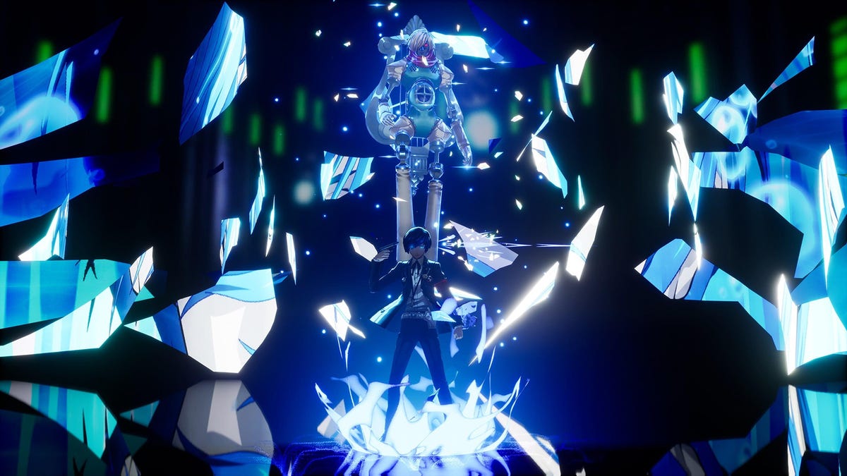
Persona 3 Reload is by no means a definitive remake of the 2006 original. It’s missing the Portable release’s female protagonist as well as FES’s epilogue The Answer (although maybe not for long). That said, Reload has a lot going for it. A graphical update, new social link content that fleshes out characters, and quality-of-life improvements make it a great way to experience Persona 3. One of the undeniably stunning features of Reload is its UI, or user interface, which is some of the most stylistically impressive pieces of design in any game. Though there is one minor piece of UI design from the original Persona 3 that is absent in Reload—and I can’t help but think it’s a major loss for the game.
Throughout Persona 3, the theme of death is constantly hammered into the player. This starts with the game’s opening cinematic and never stops. It’s everywhere in the writing, art direction, and even in the combat systems. This takes the form of an omnipresent use of pistols to represent this motif. Hell, P3 requires players to summon personas by putting a gun to each character’s head and pulling the trigger. Nobody ever accused this game of being subtle.
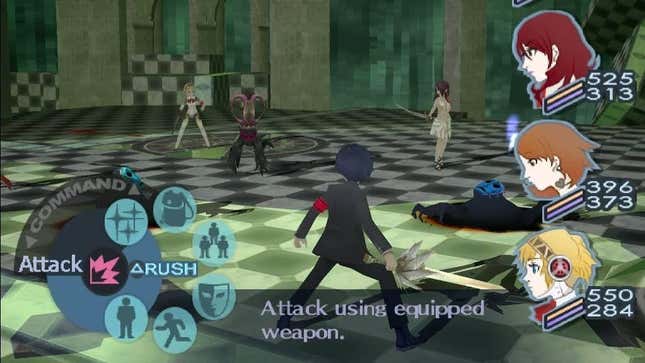
Most of the player’s time in Persona 3 is spent exploring the seemingly never-ending dungeon Tartarus. In order to keep the player constantly thinking about death even in the midst of repetitive combat, the original Persona 3 included a brilliant piece of UI design. In battle the player could choose the expected options of Attack, Skill, Items, etc. But these were laid out to the player in a revolving circle the player would rotate in an action meant to bring to mind the revolving barrel of a pistol, with each action its own bullet. With so much of combat including the use of the evoker (the persona-summoning pistol) the barrel-like design of the combat UI keeps the player constantly aware of how imminent death is for any and all of the protagonist’s party. In contrast, Reload does away with this visual reference in favor of a much more simplistic interface that maps the controller’s face buttons to unique actions. It has a little more utility but it loses the original’s thematic relevance. It’s one of the only places Reload’s UI feels like a step back.
But what is even stranger is that the idea of a revolver barrel cycling through its bullets is present in Reload’s UI, just not during combat. The interface for buying and selling items at the Paulownia Mall Police Station in Reload uses a revolver barrel with cylinders representing armor and weapons that cycles through when switching between menus. It’s exactly what the combat UI of Persona 3 used to be, just in the wrong place. Divorcing the revolver motif from combat takes away from the game’s constant dread that death is always near. It’s a small tweak, but like many of the seemingly inconsequential changes that Persona 3 Reload makes—be it the removal of the fatigue mechanic or introduction of a more saturated color palette—it too often shies away from the overtly dark tone that is so vital to Persona 3 in the first place.


