Edd Coates is founder of Game UI Database.
Game UI designers use references to iterate on existing design patterns and provide players familiar, intuitive experiences. This allows us to onboard them quickly, leading to a superior user experience (UX) and a more enjoyable product. Put simply, I have a motto: learn from the best. But it is essential we take the right lessons from other titles.
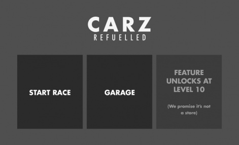
While freemium mechanics have evolved, F2P games are typically still using the same rotation of timers, ads, coins, reward ladders, boosters, and progress blockers. This familiarity means gamers are now savvier than ever.
This has led to an arms race between some F2P studios and their players – a new breed of dark pattern has emerged that provides the same old freemium experience, while slyly convincing the player to disregard unpleasantries. I call this category of dark pattern ‘purposeful neglect’.
A vital component in any F2P game is establishing trust. Concepts such as additional currencies, social media integration, and in-app purchases (IAPs) are not inherently bad, but when developers use tricks and dark patterns to steer players toward these features, this creates distrust and, ultimately, leads to frustration and a loss of player retention.
Through my research with the Game UI Database, I’ve discovered innumerable omissions and unpleasantries from a game’s UI. Here are a few that I have encountered, the steps you should take to avoid them in your own games, and successful examples in existing titles.
Auto-spending and boosters
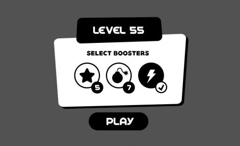
Some games automatically equip any boosters and power-ups in the player’s inventory, hoping the player won’t notice. This forces the player to manually un-equip items if they wish to keep them.
Considering these boosters have a real-world value, this is essentially spending the player’s money without their consent.
Never equip the player’s items without their permission. If you want to nudge the player towards using their available boosters, you can place gentle reminders after a few failed attempts at the same level.
Ensure you clearly define the active and disabled states of your boosters with plenty of contrast in both shape and colour. The difference should be immediately apparent, and obvious even to those with sight problems.
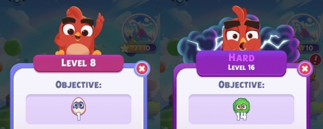
You can also give the player a subtle warning that they might need to use their boosters in a trickier level by changing the design of the pre-game menu. For example, Rovio‘s Angry Birds Journey shows a darker purple for hard levels, with unique character art at the top of the screen.
Abuse of muscle memory
Many players will repeatedly tap a specific part of the screen, in anticipation or impatience, to advance the game in certain situations. They may be trying to hide a recurring pop-up, close an advert, or simply press a button that hasn’t appeared on screen yet. This behaviour is sometimes abused by placing an unintended input where the player keeps tapping, such as a purchase button or an opt-in to an event.
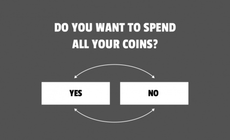
Some games have even been known to condition their players for this purpose. For example, a modal (pop-up) window might place the “Yes” button on the left side of the screen for most of the game, then switch it with the “No” button on the right when asking if the player wants to spend their currency.
Position your call-to-action buttons in a spot that players will easily recognise and not press by accident. Additionally, ensure there’s enough of a delay between the previous modal window and the next, to give the player enough time to read the text before making a decision.
Hidden opt-outs
‘Close’ buttons are often placed in unusual locations or disguised by a lack of visual contrast. This can confuse the player into performing an unintended action, such as purchasing unwanted items from a special offer.
Place your opt-out or close buttons in consistent locations throughout your game, and ensure that they contrast enough with the background to enhance readability.
Outfit7‘s Talking Tom Hero Dash uses a big blue cross in the top-right corner of every screen in the game, so the player always knows exactly where to tap to dismiss a pop-up without hesitation or confusion.
The bunny trap
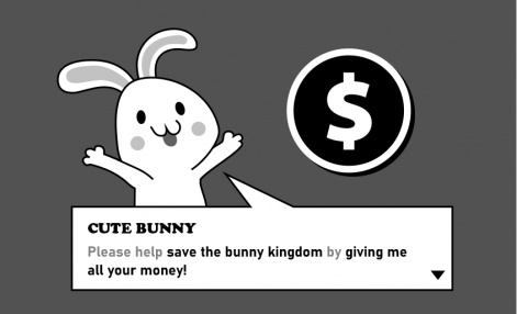
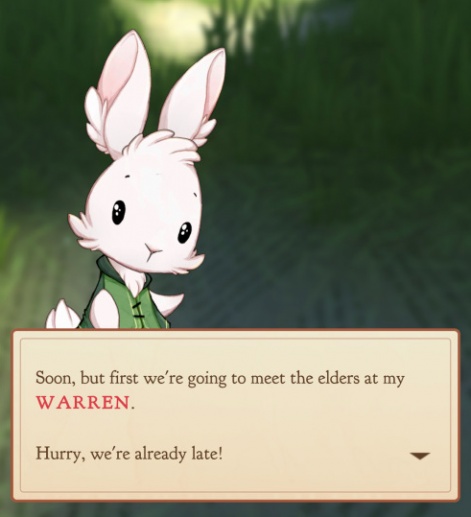
Numerous F2P titles use cute, friendly characters to onboard and tutorialise the player. This can also extend to messaging about the game’s IAPs, leading to situations where we might have a cartoon character asking the player to spend real money in the game.
While it might seem harmless, this dark pattern is often used to manipulate younger players into purchasing (or asking their parents for) items in the game.
IAP menus and store screens should be presented in a neutral voice. For all intents and purposes, the characters in your game should be completely unaware of any F2P mechanics, focusing only on worldbuilding and storytelling. When using your characters to onboard characters, ensure they are only used to encourage players with gameplay mechanics that are free.
For example, Bear Hug Entertainment‘s Alice Legends has a friendly cast of characters that are used only to advance the story and bring Wonderland to life. Store screens are presented as menus, and nothing more.
Phantom communication
Social interaction and competition between friends is a great way to improve engagement in your game, but only when it’s authentic. Dormant or international users are sometimes ‘possessed’ by an AI – taking part in multiplayer games and even communicating with the player. This is used to lure the player into a false sense of familiarity and control, or even just to make the game appear to be more popular.
Some games even impersonate people from the player’s friend list! There’s nothing so unsettling than receiving an item from a friend you haven’t spoken to in years, or finding out that your buddy in Portugal was just played by an algorithm.
Try to keep your player’s social interactions genuine and inform them when they’re not. Even if you think there’s an obvious distinction between the two, always play it safe by letting the player know if they’re playing against or interacting with an AI-controlled bot. They will appreciate the honesty.
No F2P transparency
Some F2P and free-to-start games can lure the player in with a significant portion of uninterrupted gameplay before revealing its monetisation tactics to the player. While this is annoying for the player, it’s no different to a demo and isn’t provisionally bad, but only if the player is aware they’re playing a demo or limited experience.
Some games go to great lengths to hide any paywalls, currencies, timers, or restrictions at the start, hoping to trick players into thinking they’re playing a completely free, premium product. If you plan on including a ‘demo section’ in your game, be transparent about its upcoming F2P mechanics.
The tutorial of HyperBeard Games‘ Pocket Love immediately takes the player through the Store screen, where the player is gifted some currency, and then asked to choose some furniture from a catalog. All item prices are shown in full, and both currencies are on display in the top-right corner of the screen. Not only does this teach the player how to use the store, but it also shows the player exactly what they can expect from the IAP functionality in the game.
Guilt and shame
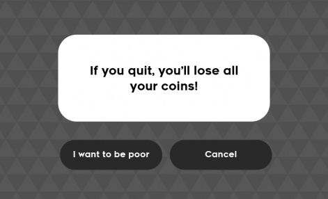
These opt-outs are clearly defined but worded in such a way that attempts to guilt the player into believing they’re losing something in the process. This dark pattern is so old that it transcends mobile games, and is often employed by pushy salespeople and shady businesses to billion-dollar internet marketfronts.
As these buttons are supposed to represent the player’s responses, they should match up exactly with what the player is specifically trying to say. In most cases, that means a “yes” or “no” option will suffice.
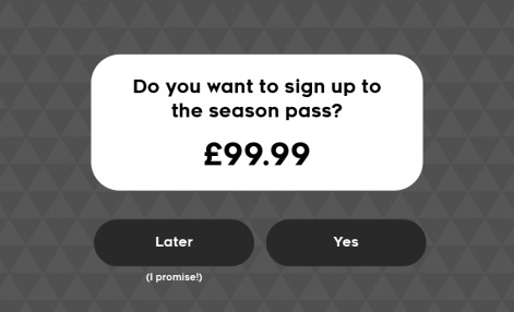
A common but slightly less problematic example of this is when the game replaces “no” with a non-committal response like “later”. While this may be a common response out of politeness in the real-world, there is no such utility in a mobile game. The player won’t be back later, they’re being forced to push a button that doesn’t match the statement of their intent.
This is a simple one to avoid. Simply stick to neutral responses like “yes” or “no” that don’t instill any shame or guilt in the player.
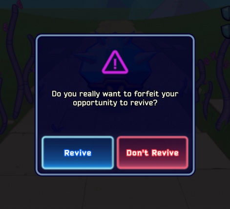
As a bonus, give your buttons a little more context to be extra helpful to your players, as in this example from Armor Games‘ Void Tyrant. The buttons have been labeled “Revive” and “Don’t Revive”, which allows the player to make their decision with a quick glance at the button prompts alone.
Ad misdirection
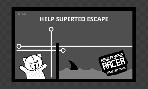
Even your ads can contain dark patterns. Infact, the examples shown above can often be found in mobile game ads, sometimes many at the same time. It’s not unusual to find misdirection, confusing call-to-actions, false/hidden opt-outs and artificial gameplay footage that completely misrepresents the product it’s promoting. Basically, ads that will succeed by whatever means necessary.
While this is understandably beyond your control as a developer, regardless of where these ads are coming from, they still represent you and the values of your studio. Be sure to partner with an ad network that minimises the negative impact on the user experience of your game.
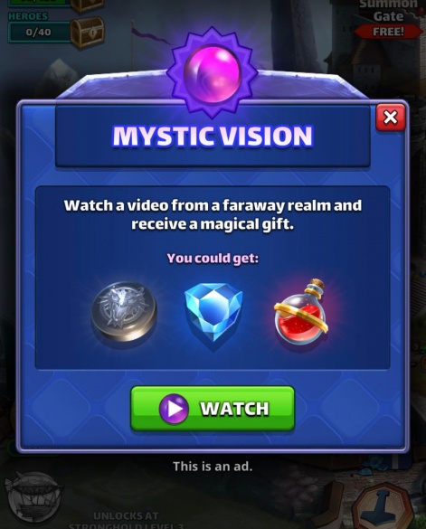
Additionally, games such as Small Giant Games‘ Empires & Puzzles make ads more of a perk than a mandatory hindrance, giving the player complete control over which ads they view, awarding a bonus for watching, and even showing a pop-up asking for their permission beforehand.
Neglectful game design appears to work because it requires the designer to take something useful away from the game, rather than add something unpleasant: although, as Jenova Chen recently said, still predicated on monetisation strategies built on negative emotions. This means that many of the dark patterns can also come from a genuine mistake, but that doesn’t make it acceptable.
It may be tempting to sacrifice ethical design patterns for cheap tricks and manipulation, but these aren’t why people keep coming back to the heavy hitters of the mobile world. Even the classics, many now over-bloated with dark patterns, started with great visuals, unique gameplay features, and a fantastic UX.
Your goal should be to provide a reliable, intuitive product that meets the needs of the player with as little friction as possible.
In my recent talk at Pocket Gamer Connects London, I emphasised that the user interface is not simply a translation layer between the player’s actions and the game itself, but also ties heavily into the branding and visual identity. If your game is making players feel uncomfortable, this is the feeling they will associate with your product – and ultimately, your studio.


