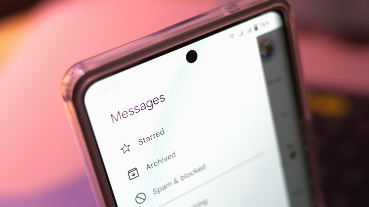
What you need to knowUsers are starting to receive a Google Messages update that removes its side nav drawer, which contained several options like Archive, Spam & blocked, and more.These can now be found by tapping your Google account photo on the right side of the app.The stable update is also removing the three organizational tabs previously found at the top of the app.It looks like Google is sticking to its guns and moving forward with a change that completely un-dos a previous addition.As detailed by 9to5Google, the company is rolling out a stable update for Messages that removes the hamburger menu nav drawer from the top left side. Instead, what Google has opted for is storing all of the drawer’s previous contents into a user’s tappable profile icon on the right side of the app. From there, you’ll find Archive, Spam & blocked, Mark all as read, and Device pairing.Google Messages’ useful category tabs, “All,” “Personal,” and “Business,” have also disappeared in the latest update for users. However, it looks like the “Auto-delete OTPs after 24 hours” still exists; it’s just tucked further away in the app’s settings.Image 1 of 2(Image credit: 9to5Google)(Image credit: 9to5Google)Aside from more noticeable (and questionable) changes, Google is switching things up aesthetically, as well. The latest update removes the top-most search bar, replacing it with a smaller magnifying glass beside a user’s Google account icon on the right. Tapping this will give users a view into several app shortcuts for starred threads, videos, images, links, and more.And in place of the hamburger menu icon, which was previously there for the navigation drawer, is the company’s quad-colored “G” icon.As previously stated, Google’s latest changes to Messages are rolling out now for all users. Keep in mind that these rollouts have a tendency to appear slowly — especially for everyone. So, while you might not find them today, check every so often for an update for Messages.This is a curious move on Google’s part, but it hasn’t come out of left field. The brand was testing these changes back in June and has seemingly gone back and forth with its design ever since. The nav drawer was short-lived as Google introduced it early in 2022, so it’s only been around for a year and change. The purpose of it was to alleviate some of the congestion packed into the app’s previous three-dot menu system, which already has quite a few goodies tucked into it.Similarly, Messages’ three organization tabs were fully introduced around the same time last year, too. It was the first time users outside of India were able to get their hands on the options.
Google Messages update officially removes nav drawer


