PocketGamer.biz does not need to express how vital user acquisition is to the mobile games industry. With IAPs driving less than 50 per cent of revenue, and privacy changes from Apple and Google disrupting the ad monetisation landscape, bringing more players onboard is only becoming more vital.
This means thinking creatively, strategically, and sometimes even misleadingly. Claire Rozain, UA team lead at Rovio, casts her expert lens on the latest user acquisition strategies in her new weekly column, UA Eye.
Zynga aims small
Zynga subsidiary Small Giant Games’ Puzzle Combat is a successful Match3 that features strong elements of the RPG genre, including a significant story mode, character collection, boss fights, PvP, and player interaction through alliances and clans.
Due to this, and in stark contrast to classic puzzle game player bases, the primary audience for Puzzle Combat is mainly based in Brazil, Germany, and the US, and leans male.
RPG games, by design, have significantly more expensive CPI as they lack the widespread appeal of hypercasual and casual games, and typically use niche art styles that do not have a ubiquitous appeal.
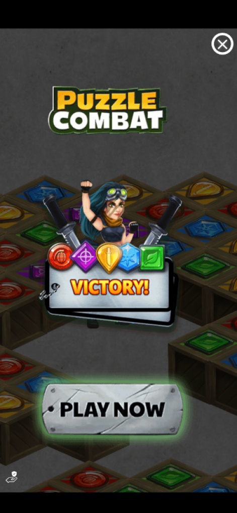
But I want to take a look at an ad network video with playable ads for Puzzle Combat as an example of high execution and clearly demonstrating the strengths of the RPG genre.
The breakdown
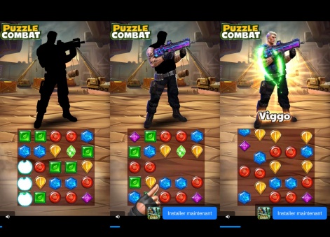
1. Character cosmetics progression: While the player is matching gems, they are simultaneously discovering the appearance of their character.
Skins in RPGs are hugely important as it is intrinsically connected to the character and individual experience. The link between the core and the meta game is also strongly executed on – progress on the core is reflected in the discovery of the skin.
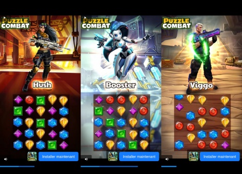
2. Diversity of expression: In the RPG genre, diversity of expression is of paramount importance! Players want to get a skin that speaks to their persona.
In this ad, you can see a wide variety of characters from male to female to robots! Working toward the personality of the character is also important in order to make the player project themself into the character.
But you’ll see that the ad also displays each character’s name. These are not featureless ciphers for players to overlap themselves onto, but rather characters with distinct personalities and a diversity that allows players agency in preference.
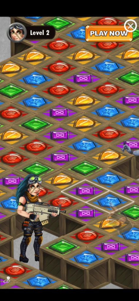
3. CTA on top: This seems straightforward, but look closely. The CTA is in the top right corner.
I’ll share a vital tip: CTAs used in ads on ad networks not readable whatsoever – the UI of the ad network will often, if not always, be obscured by the network’s own CTA.
Adding a logo and CTA at the top of the screen is best practice for ad network channels.
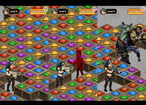
4. Playable to win: The ad includes a four-five clic playable with a win condition. Frequently, people think that shorter-equals-better, and while often accurate for video (of course, not for rewarded video), this is not always the case on playable.
The longer the funnel, the better the conversion. It’s important to test the amount of clics while you’re testing playable.
5. Emotion-led endcard: The endcard finishes on a satisfying victory, a firm way to end an emotion-led creative!
This is a really good ad. But while I like the mix of 2D and 3D in the playable ad, I think the red colour used to highlight the enemies does not contrast enough with the red matchables in the playing field.
Getting a bright and immediate constract helps with visiblility – I would recommend choosing red for either the enemies or gems, but not both. Otherwise, really good work 🙂
—
You can find every weekly installment of Claire Rozain’s UA Eye through this link, and for more from Rozain, check out the Puzzle Society.


