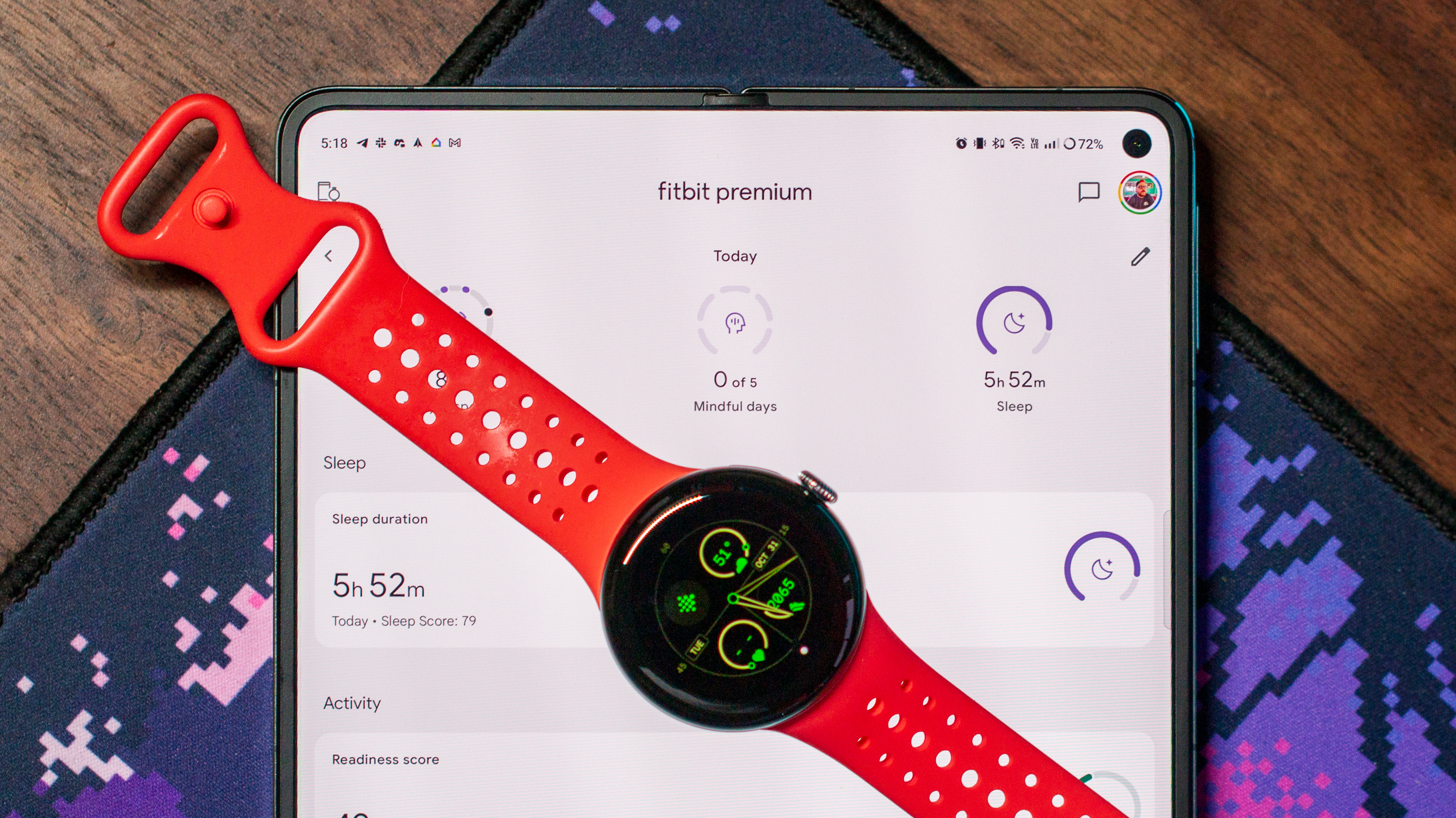
What you need to knowGoogle has overhauled the Fitbit app since it officially acquired the company in 2021, making it fit in line with Material You design language.In an interview published to the Google Design website, the Fitbit UX team explained how it decided to adapt the Fitbit app to integrate it with Google platforms. The designers share the thought process behind the transition, which has spanned two years and is still ongoing. Google officially closed its deal to acquire Fitbit roughly three years ago, and it is still working to integrate Fitbit into its health portfolio and larger devices and services ecosystem. We can see the effects of this project in a few ways, like the Fitbit app redesign matching the Material You design language. However, we just got a rare look at the thought process behind Google’s visual redo of the Fitbit app through an interview with the Fitbit UX team posted on the Google Design website.While it’s obvious that the new Fitbit app — which has been rolled out in parts starting last year — fits the Material You theme, designers had to start working on the project before it was finalized. They started work two years ago and leaned into the Light and Space art movement that originated in Google’s home state of California in the late 1960s. “We knew there was momentum around the concept of ‘form follows feeling,’ we knew it was about personalization, and we knew it was all about you — that worked really well for celebrating the best of Google with Fitbit,” said Mat Helme, a Fitbit product and brand design lead. This approach towards design is how we got the Fitbit app as it appears today, with light backgrounds, rich colors, and multiple pastel shades. We can see the effects of Google and Fitbit’s design preferences still directing app updates, like the just-released Fitbit Sleep revamp. (Image credit: Android Central / Google)”Having Fitbit lean into rounded forms and softer colors feels fairly unique, and the circular form factor is a big part of how we design for that uplifting and compassionate feeling,” said Judy Zhao, who is a leader of the Fitbit visual motion and systems team. “We’re able to do this because we’re combining multiple worlds into one holistic health journey experience.”However, it’s about more than just design. The designers at Fitbit also wanted to make health and fitness metrics available in a way that was easy to digest. “We’re on a journey as a product team to become less about data collection and more about giving you insight and actionable information to take charge of your health journey,” said Fitbit UX Design Lead Sarah Wilson. In practice, Wilson says that this entails using charts and text to explain all the fitness and health jargon that might not be naturally understood by everyone. Going a step further, Fitbit wants to make it easier for users to take recorded data and apply it to make the right fitness and lifestyle changes.Get the latest news from Android Central, your trusted companion in the world of AndroidThat leads us back to the Google Pixel Watch 2, which has the circular form factor to match Fitbit’s rounded design preferences. It also includes the sensors required to provide the data Google wants to share in a simple way. So, it stands to reason that the Pixel Watch — and its circular form factor — is a big part of the Fitbit strategy moving forward.
The peak of Google and Fitbit integration
The Pixel Watch 2 combines Google’s smartwatch prowess and Fitbit’s extensive experience in health. If you’re a looking to get a great Fitbit, the Pixel Watch 2 might actually be the best choice.


