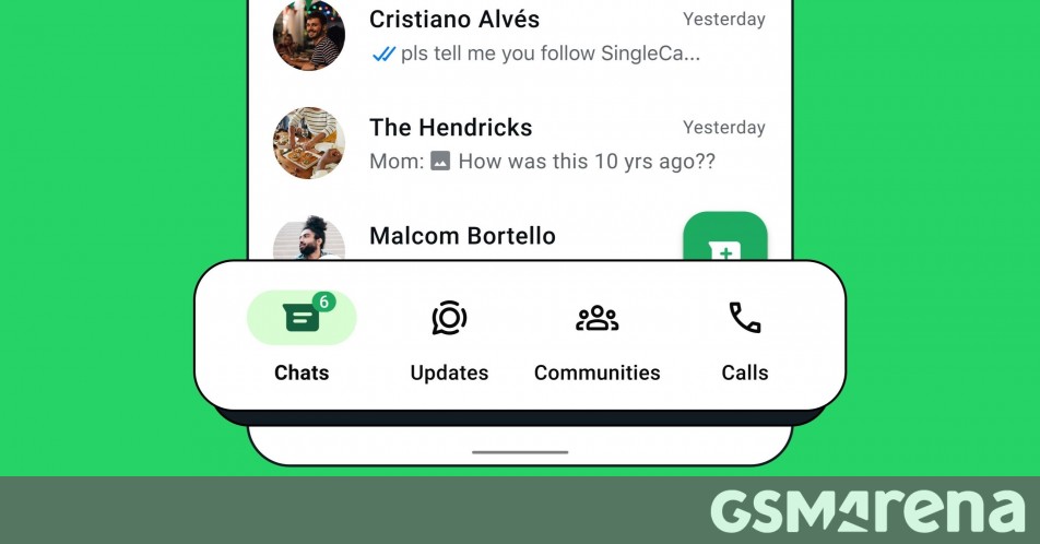
WhatsApp has announced a new bottom navigation bar for Android users, which replaces the older top navbar that had four tabs for Communities, Chats, Status, and Calls.
The new navbar, which is “closer to your thumbs and easy on the eyes,” also has four sections for Communities, Chats, Status, and Calls. However, their order has been changed, and Status is now called “Updates.” Moreover, all four sections now have icons. Previously, only the Communities tab had an icon. Besides, while the older navbar was green, the new navbar is white.
Old navbar • New navbar
WhatsApp said it “moved some things around to make it easier to access what you need, when you need it.” That makes sense because while you can still switch between the four sections by swiping left or right on the screen, if you want to open a non-adjacent tab, you don’t have to stretch your thumb to the top of the screen since the navbar is now closer to the thumb, allowing you to switch between the tabs by clicking on their icons.
We had this new navbar on multiple Android devices in India for about a couple of weeks, but with an official announcement, WhatsApp is now rolling it out to its users worldwide. If you haven’t received it yet, update the WhatsApp app on your Android device to the latest version from the Google Play Store.
Source

